Cyranix
Website Design
Overview
Creator: Siraj Wakko
Developer: Mohammed G.
Tools: Figma, Photoshop
Duration: 3 Weeks
Role: UI/UX Designer, Wireframing, Prototyping
Year: 2025
Release: https://www.cyranixllc.com/
Overview
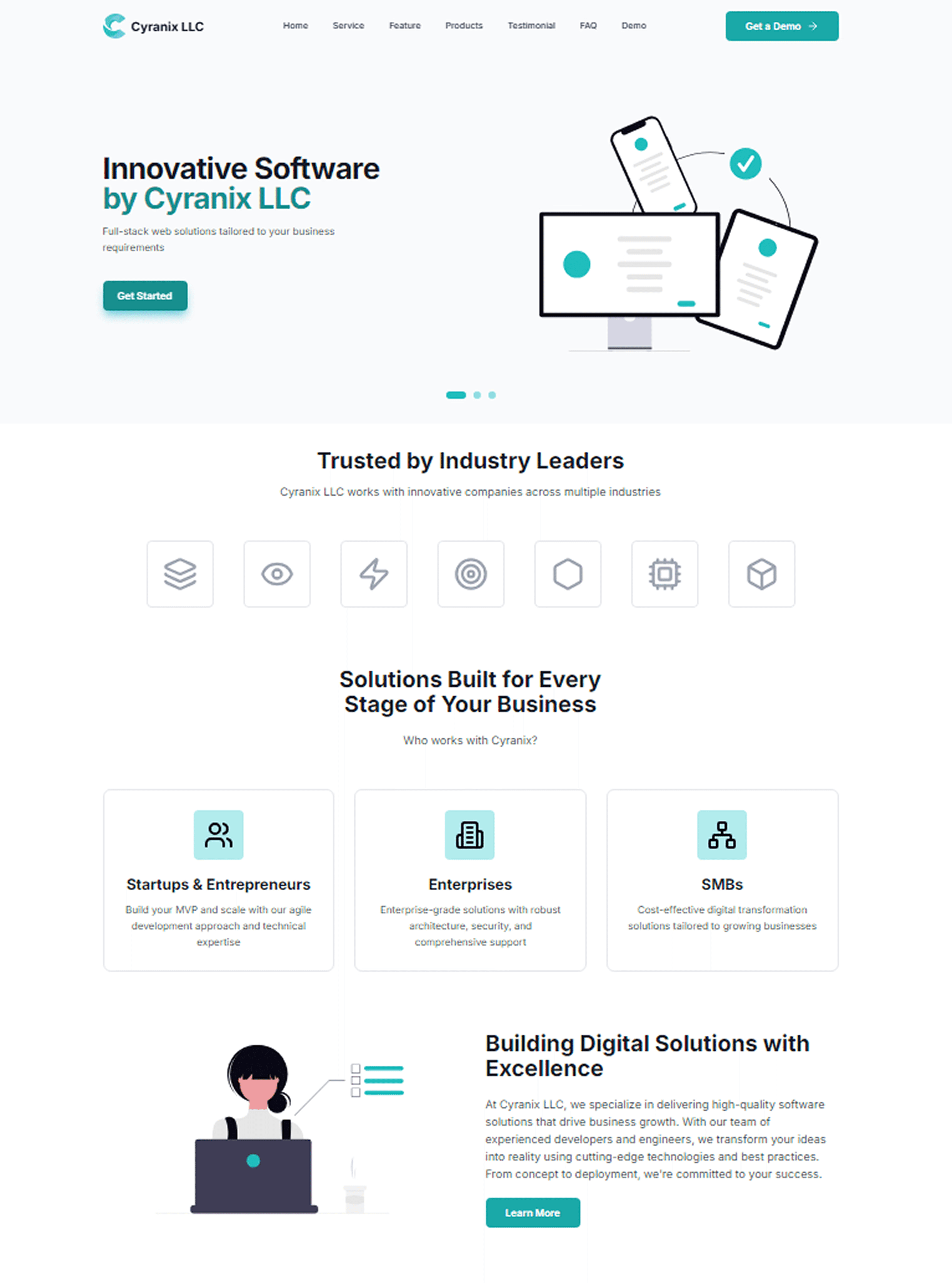
Cyranix LLC is a US based startup offering cybersecurity, full stack web development, mobile applications, cloud services, and desktop solutions. During my internship, I was tasked with redesigning the company website from the ground up by turning a static, generic template into a polished, conversion focused digital presence that reflects the company's technical credibility and expertise. The redesigned site spans a multi page architecture all tied together with a consistent design language rooted in trust, clarity, and forward momentum.
Problem
The original Cyranix website faced a fundamental challenge common in early stage tech companies. It might struggle to communicate credibility at first glance. Visitors landing on a cybersecurity company's website have an unusually high trust threshold and they're evaluating whether to hand over sensitive business infrastructure decisions. The old site wasn't hitting that criteria. I broke it down into 5 areas that needed improvement:
No clear hierarchy -
Services, differentiators, and CTAs competed for attention without a logical reading flow.
Generic visual language -
Stock icons and template layouts gave no signal of technical depth or professionalism.
Weak conversion paths -
The demo CTA was hard to find and the highest value action was the least prominent.
No social proof structure -
Testimonials and stats existed but weren't positioned to build trust at critical decision moments.
Service clarity missing -
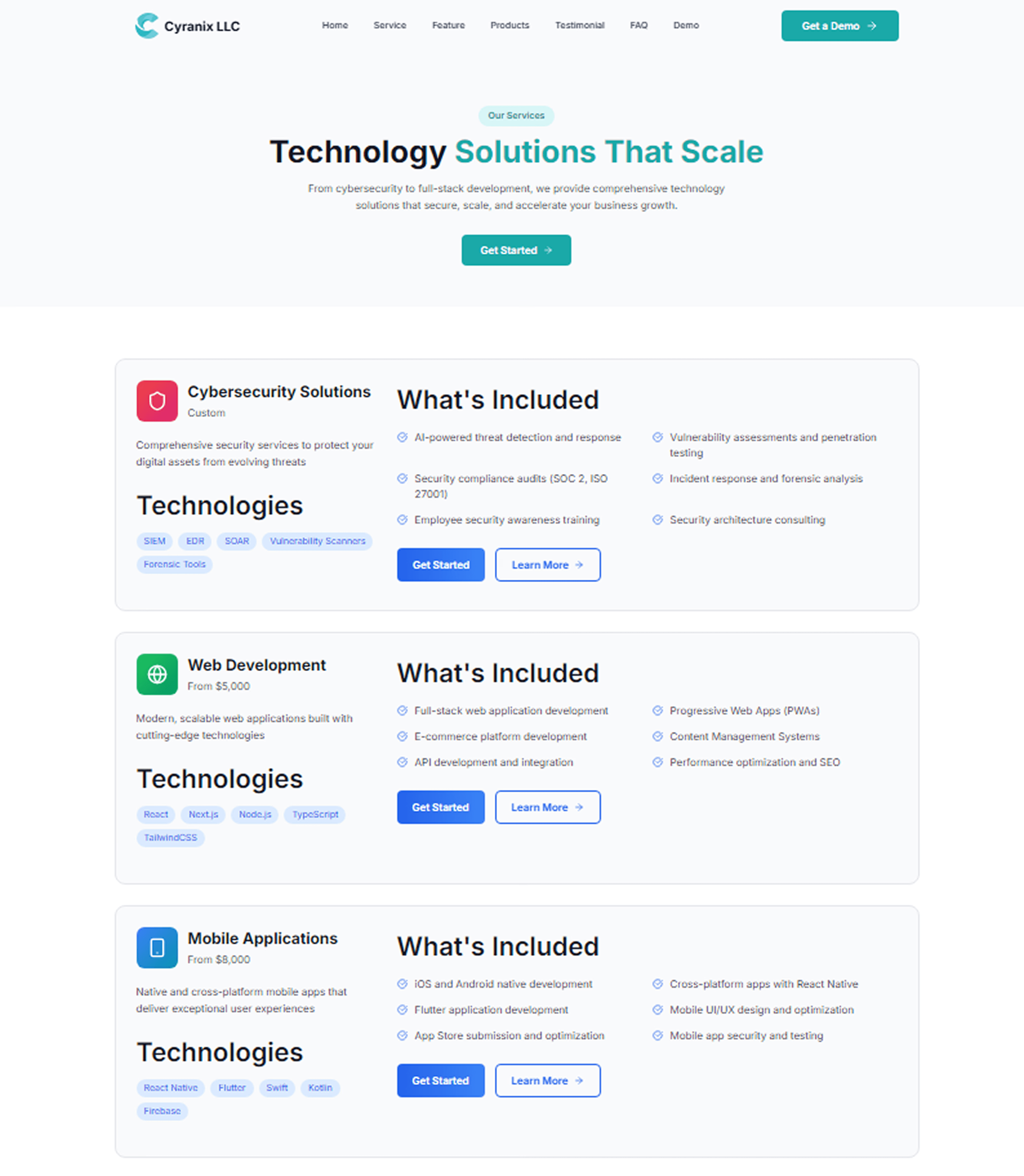
Five service lines (cyber, web, mobile, cloud, desktop) were listed without helping users understand which applied to them.
Solution
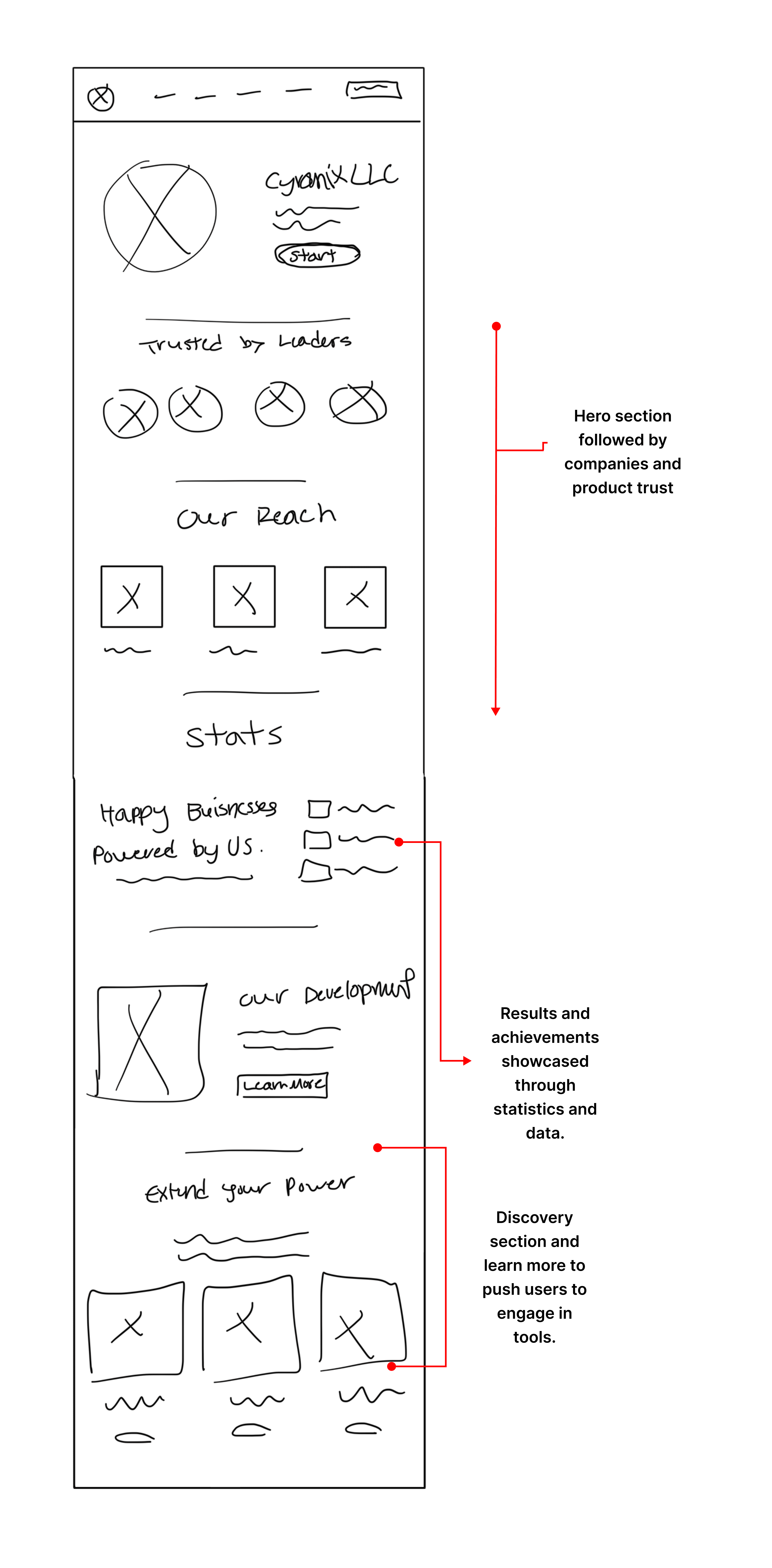
The redesign focused on three priorities: first establish trust, then explain value, then drive action. Each page section was designed with a deliberate purpose in the visitor's decision journey.
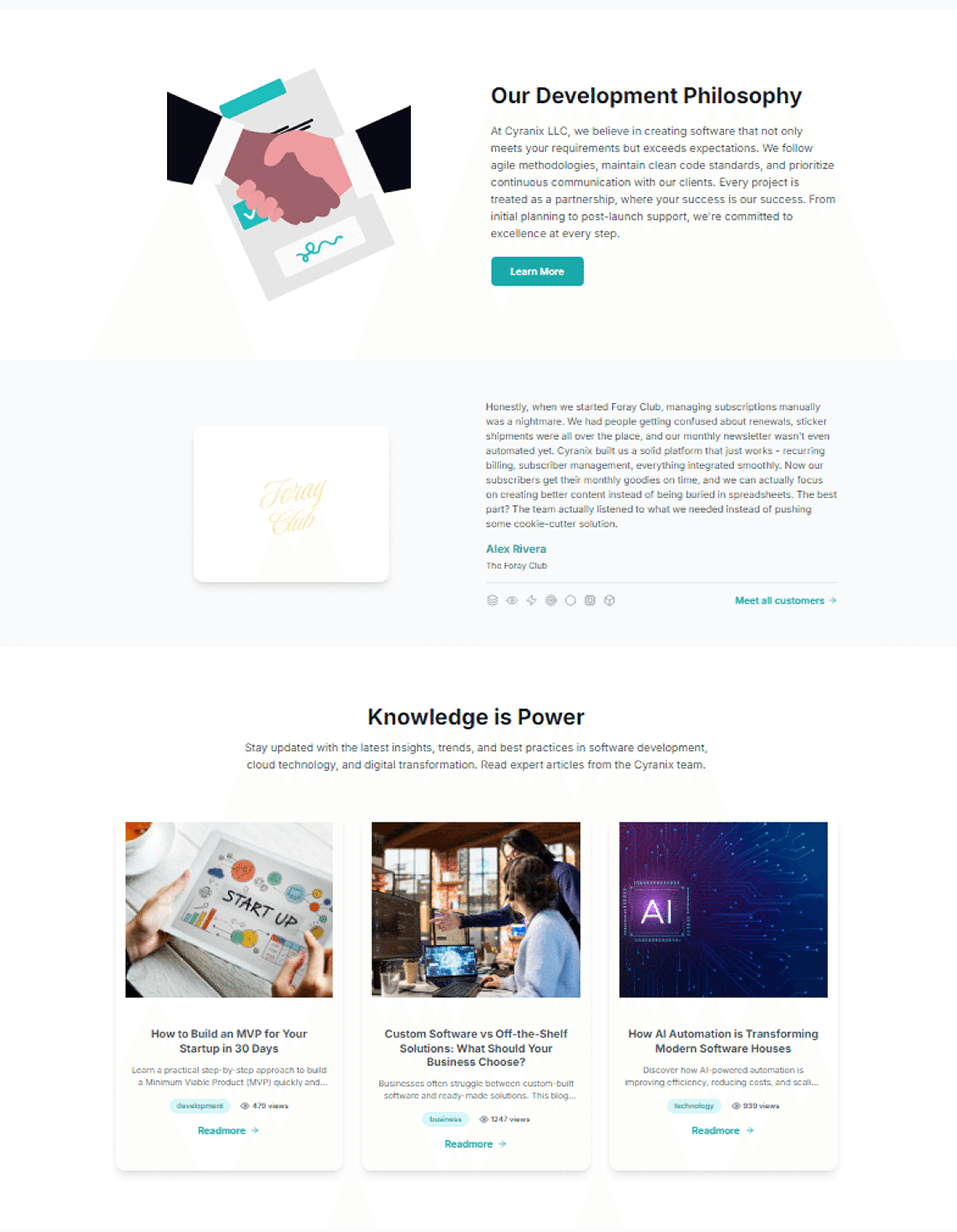
Trust Architecture - Teal color system signals precision and reliability paired with icon badges, Client testimonials placed after philosophy, and consistent logos plus nav on all pages reinforces brand authority
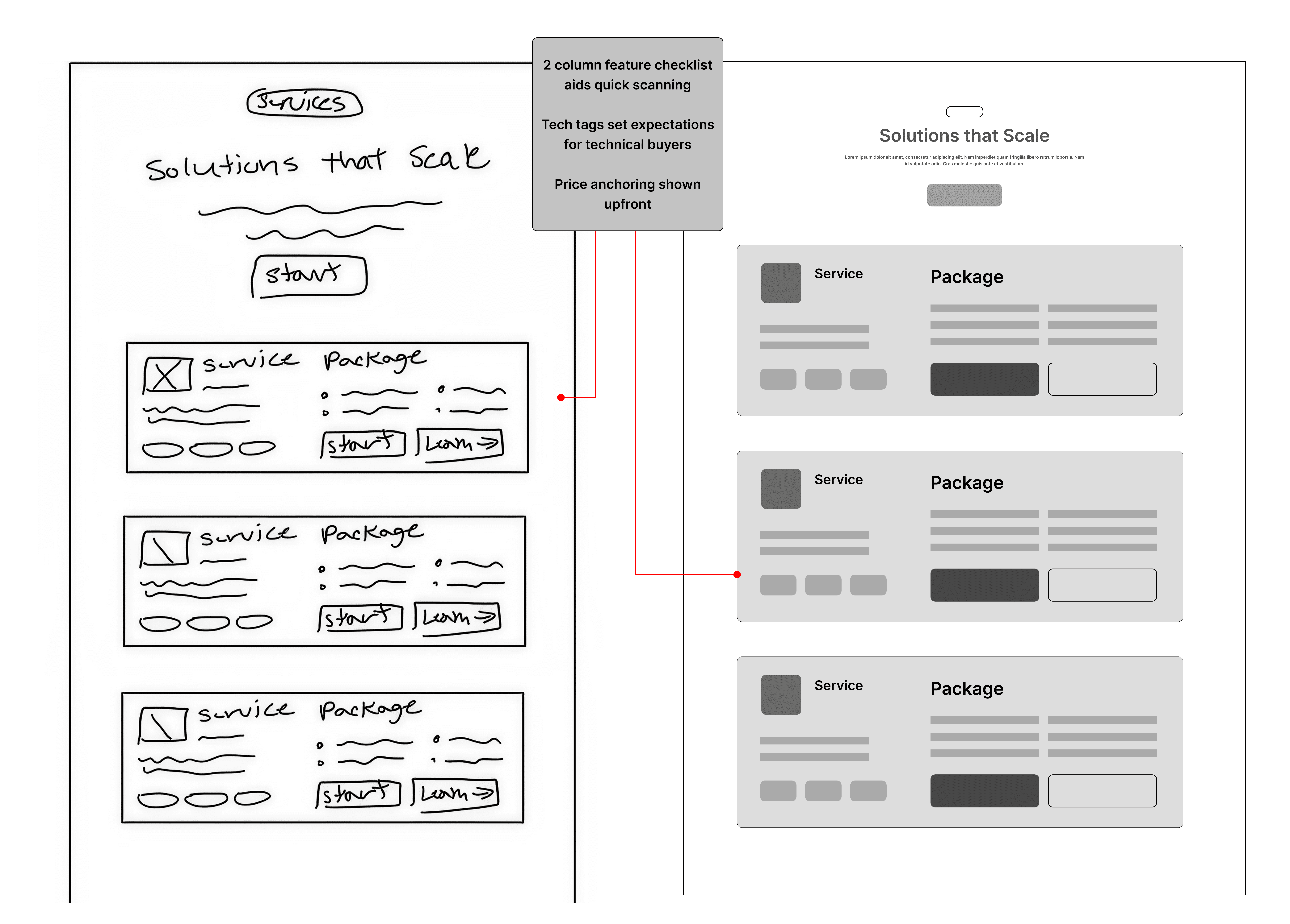
Service Clarity - Card layout with icon, price, tech tags, and included features
followed with a two column feature grid inside each card aids scanning. Technology tag pills set expectations for technical buyers.
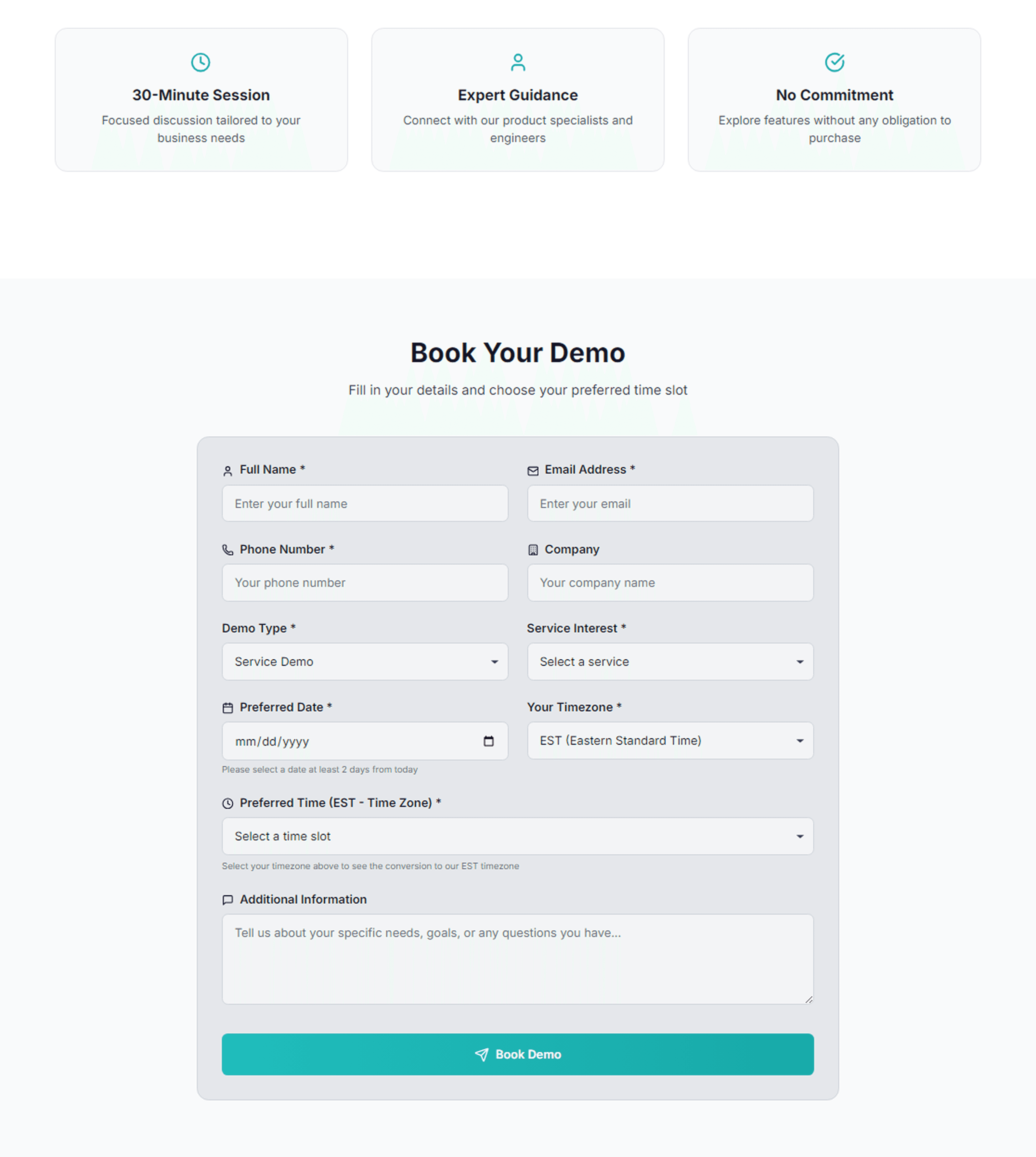
Conversion Design - A demo button in nav on every page which is always one click away. Time zone aware time slot picker reduces friction. Form organized into logical groups which are identity, intent, and finally scheduling.
Early Wireframes

Design System
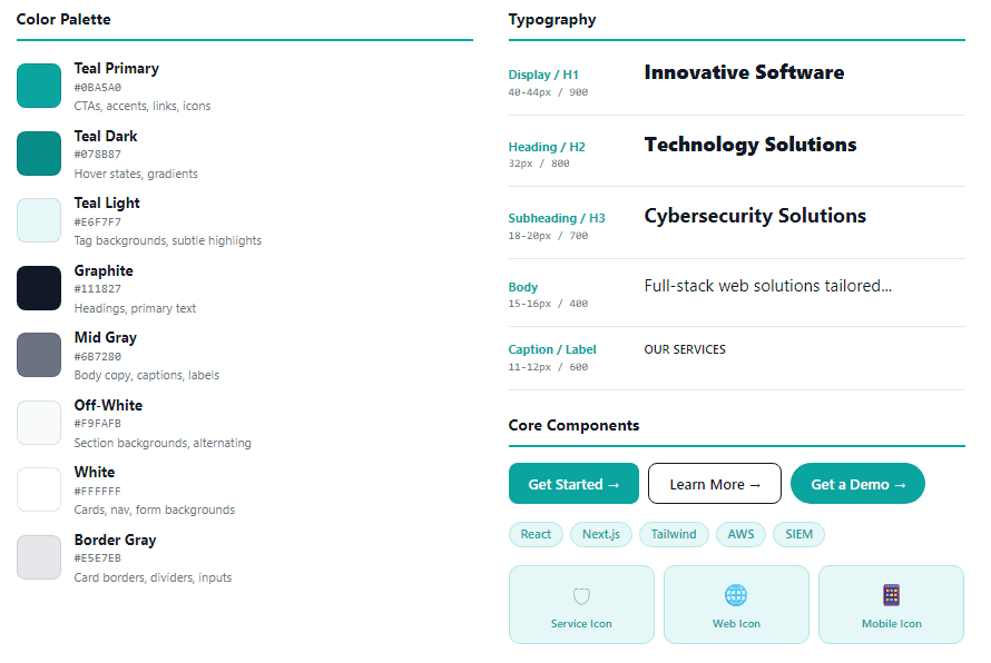
The color palette was built around companies updated brand blue, ensuring consistency with the new logo while reinforcing brand recognition. A lightweight design system governs all visual decisions across the Cyranix site, ensuring consistency from marketing pages through functional forms. Together, these shades create a clean, contemporary aesthetic that reflects the company’s identity and aligns with modern design trends in the tech industry.
Designs